The position Property:
Position property is used to set position for a element. We can position using top, bottom, left, right properties.
In CSS five different types of position property available:
- Static
- Fixed
- Relative
- Absolute
- Sticky
1. Static Property:
Static property is set by default. If we don't mention this method to any element, the element has the method static by default. If we apply the position property like top, bottom, left, right will not affect the position of any element. The element will be position with the normal flow of page.
Example:
      p{
          position: static;
      }
2. Fixed Property:
Fixed property is used to fixed that element on the page. It allow an element to fixed its position even when we scroll the page. We can set the position of the element using the top, right, bottom, left.
Example:
      p{
          position: fixed;
          top: 10px;
          left:10px;
      }
3. Relative Property:
Relative property is used to set the element relative to its normal position. When we apply position value in that property it will shift from its normal position.
Example:
      p{
          position: relative;
          top: 10px;
          left:10px;
      }
4. Absolute Property:
Absolute property is used to position an element relative to its closest parent element. If absolute element has no positioned parents, then it uses the document body and move along with the page.
Example:
      p{
          position: absolute;
          top: 10px;
          left:10px;
      }
5. Sticky Property:
Sticky property played a role between fixed and relative property. When element is sticky and it is placed in the middle of the page then when we scroll the page it start scrolling until it touches the top. when it touched the top it will fixed on that position and will not move when we further scroll.
Example:
      p{
          position: sticky;
          top: 10px;
          left:10px;
      }
The Flexbox Property:
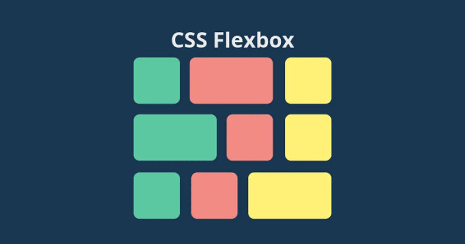
The flex box is build to design one dimensional layout in css. Flex it the value of css display property. By using display flex property in parent element child element automatically align in one dimensional layout.
Using the below code we will explore the flex property.
<div class="container">
    <div class="item">Item 1<div>
    <div class="item">Item 2<div>
    <div class="item">Item 3<div>
    <div class="item">Item 4<div>
</div>
1. Display Flex:
Display flex is the property of css to use flexbox. The above example will show the list of item in column wise because
.container{
          display: flex;
}
2 Flex Direction:
Flex Direction property is given to flex container to change direction of flex items. By default, flex direction is row. flex-direction values are [row(by default), row-reverse, column, column-reverse]
.container{
        display: flex;
        flex-direction: row;
    }
3 Flex Wrap:
Flex item by default display in one line and doesn't come to next line but flex wrapis used to allow item in next line when enough space is not available. flex-wrap values are [nowrap(by default), wrap, wrap-reverse]
.container{
        display: flex;
        flex-direction: row;
        flex-wrap: wrap;
    }
4 Justify Content:
Justify content property is used to define the alignment into main axis. justify-content values are [flex-start, flex-end, center, space-between, space-around, space-evenly].
.container{
        display: flex;
        flex-wrap: wrap;
        justify-content: flex-start;
 }
5 Align Items:
Align items property is used to define the alignment of flex item into horizonal axis. align-items values are [stretch(by default), flex-start, flex-end, center, baseline].
.container{
        display: flex;
        flex-wrap: wrap;
        align-items: flex-start;
 }
6 Order:
Order property is used to set the order of flex item in which the appear in container. The default order is 0.
.item{
        padding: 5px;
        border: 1px solid black;
        margin: 5px;
        order:0;
 }
7 Flex Grow:
Flex grow property define the growth ability of an item. The default value is 0. means item takes space(width) as much as content available. If we set flex-grow to 1 then width will be equally distributed to all to all item.
.item{
       padding: 10px;
        border: 1px solid black;
        margin: 5px;
        flex-grow: 1;
    }
8 Flex Shrink:
Flex shrink property define the ability of shrink if required. The default value of flex-shrink is 1.
.item{
       padding: 10px;
        border: 1px solid black;
        margin: 5px;
        flex-shrink: 1;
    }
